Thursday, July 30, 2009
Have you checked out SPCC???
Do you like my new button on the sidebar??? If you click on it you will go to SPCC which is the Scrapmaster's Paradise Colour Challenge. We would love to see new participants atSPCC. Don't worry if you are new to posting. I know that the first time I ever posted on a challenge blog I was terribly uncertain. I would be posting against some fabulous people whose blogs I had 'stalked' on a regular basis. But don't worry about this. Everyone LOVES to see new ideas and new inspiration so I strongly encourage you to check out SPCC and enter the challenge. There's some awesome blog candy up for grabs this week.
Wednesday, July 29, 2009
Time for Mojo Monday
So here's my attempt at Mojo Monday Sketch 97. I also used the colours from this week's Colour Throwdown. They were Perfect Plum, Certainly Celery, and Chocolate Chip. This card was supposed to be an all Stampin' Up! card, but I just bought these new Label 4 Nesties and I couldn't wait to use them. Stamps: Merci, Teeny Tiny Wishes. Ink: Perfect Plum, Chocolate Chip, Certainly Celery, Pale Plum. Paper: Perfect Plum, Chocolate Chip, Certainly Celery, Whisper White. Accessories: Build-a-Brad, Whisper White Satin ribbon, Modern Label punch, Movers & Shapers die, Photo Corner punch, Green Brads & Heart brads from dollar store.
Tuesday, July 28, 2009
Tuesday Tutorial #12
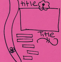
Well, seeing as I've been doing a lot of work for challenges lately, this page was made for a combination of challenges. By the time I actually post this, some of these challenges will have expired, but I'm focusing most of my energy on SPCC. And so that's how these layouts came about. It all started with the colour throwdown challenge. The colours were Perfect Plum, Certainly Celery and Chocolate Chip. PURPLE and GREEN!!!!! My absolute favourite colour combination. How could I turn it down? Next I found sketches. (they're pictured below each layouts) The top sketch is from 52 Sketches and the bottom sketch is from Triple the Sketch.
As you can see this is a two page layout. The top page was created for a challenge at Scrap Arts. The challenge was 2 or more photos, ribbon, 2 pattern papers, stamps, and buttons. I really struggled with the top layout. I had these adorable but out of focus photos of my daughter, so I decided to make the layout very busy so that the photos weren't the focal point of the page. After I completed the page, it just seemed too plain so I added the stamped flowers to the plum paper. This brings me to the detailed part of this tutorial. What do you do if you don't have all the colour cartridges but you want to use a stampin' wheel? Well if you simply roll it over an ink cartridge you have a limited range because once the wheel turns around once the ink is all used up and the image fades - see the photo below. The image faded right at the top of the page.
So to cover an entire page like above I started from the outside and rolled towards the middle of the page and then stopped in the middle.This won't work with all wheels of course, but Scatter Sunshine is perfect for this. When rolling the stamp on the ink pad I start at the top of the pad...
and then roll to the bottom of the pad.
Now here's the trick, don't simply roll the stamp back and forth, instead you need to pick the stamp up from the pad and place it back down on the top of the pad. This way the entire roll gets covered in ink.
Supplies: Stamps: Scatter Sunshine, Smarty Pants. Ink: Perfect Plum, Certainly Celery, Chocolate Chip, Pale Plum. Paper: Green DSP from Bo Bunny, Perfect Plum, Certainly Celery, Whisper White, Chocolate Chip. Accessories: Pretties Kit, Celery eyelets, Spelbinders labels 4, Metal edge tag from Making Memories, Stampin' Write Markers, buttons from dollar store and ribbon from Mike's.
Monday, July 27, 2009
Scrapmaster's Paradise Colour Combo 8
Here's my first card as a SP Diva. Wow did this colour combo stump me. It took me all evening to come up with this one. Generally I'm not a huge fan of earthy tones, but hey, going out of my comfort zone is part of being on a design team. Anyway, now that it's finished I'm actually pretty pleased with it. Do you like my new watermark? I bought it from the sweetest thing. The flower image was stamped with the 2 step stampin set Soft Summer and then touched up with an aqua painter. The mellow moss cardstock was run through the big shot with the dotted cuttlebug folder.
Supplies: All SU unless otherwise noted. Stamps: Soft Summer, Teeny Tiny Wishes. Ink: Mellow Moss, Crushed Curry, Dusty Durango, Brown Staz-On. Paper: Raspberry Lemonade DSP, Watercolour paper, Mellow Moss, Dusty Durango. Accessories: Hodgepodge Hardware, Stampa-ma-jig, Dusty Durango 1/4" dotted grosgrain ribbon, 1"circle punch, Aquapainter, stampin' write markers.
Sunday, July 26, 2009
I Won!!!!
Good fortune has been with me for the past while. I entered this page into a contest at Scrap Arts (my local scrapbooking store) and for the second time this year I won a prize. This time it was a set of clear stamps. This page has been posted before, but as a refresher, the challenge was to use blue and green cardstock, a 3d item, more than 2 photos and bling. I made the frog, lilypads, logs and weeds from punches, and the flowers were punched out of DSP. The waves were cut from some lacy cardstock. The photos are of me, my kids, my brother and his son and my mom when we were down in Palm Springs earlier this year.
Saturday, July 25, 2009
A Tale of Two CASE's part 4
This card was made using the movers & shapers die for the big shot. It's another of my cards which I CASED from two others here and here.
Ink: Melon Mambo, Rich Razzleberry, Crushed Curry. Stamps: On a Pedestal, Teeny Tiny Wishes. Paper: Rich Razzleberry, Melon Mambo, Crushed Curry, Whisper White, Razzleberry Lemonade. Accessories: Modern Label punches, Movers & Shapers die for Big Shot, Polka Dot 1/2 inch Grosgrain (Rich Razzleberry), Stampin' Dimensionals, Filigree Brad.
Wednesday, July 22, 2009
Scrapmaster's Paradise!!!!
Monday I announced that I am an SP DIVA!!! I made the inaugural design team at SPCC. SPCC stands for Scrapmaster's Paradise Color Combo challenge blog. It was created by Samantha, the scrapmaster who is just the greatest chick ever. That woman is busy! She's a daily craft blogger at Scrapmaster's Paradise and the creator of the SPCC and just an all around amazing woman.
Anyways back to SPCC, it is a weekly color challenge blog. Each week on Mondays a color combo of 3-4 colors are chosen by Samantha and you have until Sunday night to create a layout, card, altered item or whatever you choose and link it up to Mr. Linky. All of the colors are based upon Stampin Up colors but you can use similar colors from your favorite paper or stamping lines. Of course there are fabulous prizes to be won each week. In addition to a great prize each week there is a winner and a top 5 chosen, these lucky participants get to brag on their very own blogs with a great blinkie celebrating their win.
In addition to the weekly color combo, SPCC hosts the Finally Friday challenge which can be a challenge about anything. It changes from week to week and from host to host. Each week there is a new challenge and a new host. It could be a design team member, a guest designer, Samantha our creator, or even you!
There are 12 amazing SP DIVAS who are broken into two teams to bring you a variety of great ideas and inspiration for your projects. There is a mix of both cards and layouts, with some great altered items thrown in there at random. I am a card designer and will be making my very first design team layout debut with challenge # 8 which will premiere on July 27th. Then I will be designing for every other challenge, although you may see a design or two from me on my off weeks.
In the mean time why don't you check out the current color combo challenge #7. Entries for this challenge are due by Sunday, July 26th. This week's fabulous sponsor is Elmer's Glue. I know what you are thinking, I haven't used Elmer's glue for my scrapbooks since I stopped cutting out construction paper and wrapping paper for my projects. Well think again, Elmer's Glue has a whole new line for crafting. Included in the prize package is: one gold and one silver metallic paint markers and one craft bond scrapbook glue set, which includes a photo glue stick, fine tip glue pen, a memory book glue pen (liquid glue pen), and an extra strength glue stick. So stop on by, check out our design team and all the great creations.
Tuesday, July 21, 2009
Tuesday Tutorial #11
I just couldn't wait to get down and use this paper when my box of new stuff arrived last month. This layout was inpired by a photo of me and my daughter on my brother's boat. We were having a family picnic to celebrate our birthdays which are only 12 days apart. I went through the photos from that day and pulled out a few of my brother and I. After playing around with the pictures, I decided that although I love the photo of myself and my daughter, I needed to crop her out of this layout. I'll save the entire photo for another layout. This is a new Level 3 hostess scrapbook set. I pulled out two pieces of DSP from the Lovely Flowers Hostess Bundle, and One piece of Rich Razzleberry cardstock.
I then played around with my central photo and decided to matte the photos on Rich Razzleberry as it offered the best colour contrast. Because of this, I decided that the Rich Razzleberry DSP was best for the background.
After playing around a bit, I decided on the above layout to start. This changed as I moved around the background paper.
After some experimentation, I decided to use these three piece of DSP from Lovely Flowers and print out my journaling right on to the DSP itself. But the DSP needed to be small enough to fit in my printer, so I cropped it to 8 inches. After I printed out the journalling, I decided to trim the overlapping edges with the scallop edge punch. And finally I adhered the three pieces of DSP together. A great tip is that if you are putting together paper to make a background for a 12x12 page, the scor pal works wonders. By lining it up in the actual scor pal, the edges will be all straight and the paper will line up perfectly.
Once I did my journaling, the title fell into place quite nicely. The white letters are cut with the Bilboard die for the big shot. The coloured flowers are cut from the DSP on the end. I used the wide oval punch for the sub-title and large oval scallop nesties. Some of the photos and the number '40' are popped up with dimensionals.
I then played around with my central photo and decided to matte the photos on Rich Razzleberry as it offered the best colour contrast. Because of this, I decided that the Rich Razzleberry DSP was best for the background.
After playing around a bit, I decided on the above layout to start. This changed as I moved around the background paper.
After some experimentation, I decided to use these three piece of DSP from Lovely Flowers and print out my journaling right on to the DSP itself. But the DSP needed to be small enough to fit in my printer, so I cropped it to 8 inches. After I printed out the journalling, I decided to trim the overlapping edges with the scallop edge punch. And finally I adhered the three pieces of DSP together. A great tip is that if you are putting together paper to make a background for a 12x12 page, the scor pal works wonders. By lining it up in the actual scor pal, the edges will be all straight and the paper will line up perfectly.
Because I needed to crop the smaller picture of my brother and I carefully to cut out distracting images, I decided to use my largest circle punch (2 3/8inch) but a coluzzle or circle scissor plus would work as well. The only problem for me was that when I punched out the circle, part of the image got damaged near the edge. To fix the problem, I decided to sand the edges of the picture which was simple enough to do with the smaller circle images. I then needed to sand the larger photos, and found it to be very difficult until I lined the page edge up with the edge of the table which gave me some even resistance and made for a nice edge. Finally I added to the layout a picture of my brother and me as children, and a picture of our birthday cake from last month. To make the '40' out of DSP I started with the 1 3/8 inch circle punch and then used the 1 1/4 inch punch to make the '0' Next I cut the '4' by hand to match the size of the '0'
Monday, July 20, 2009
I'm SOOOOOOOOO Excited!!!
I am absolutely thrilled to announce that I have been chosen to join the design team at SPCC. I've been really focusing on entering challenges this summer and I actually won one at SPCC a few weeks ago. This inspired me to apply to be a SP Diva. I was also pleased to find out that my sideline Sabriena was also asked to be on the team. I can't wait to showcase some of the challenges and projects that we will be presenting. To meet all of the design team, check here.
Not Really a CASE
I made this card a few months ago for my father-in-law's birthday. I had just received this sneak peek set, and I was dying to use it. I found this card on splitcoast and CASE'd it (well actually it's more like a copy, not a case but...) So it's a mix of old and retiring paper and colours and new stamps.
Stamps: On A Pedestal. Ink Basic Gray, Riding Hood Red. Paper: Walk In The Park DSP, Sahara Sand, Basic Gray, Riding Hood Red, Whisper White. Accessories: Coluzze, ticket corner punch, stampin' dimensionals, brads (from my stash)
Saturday, July 18, 2009
Sweet Sunday Inkspirations
I made this card for my DH's upcoming birthday this week. When I came across this colour challenge I knew that my hubby would love them. Green is his favourite colour after all. I started with this robot set because my husband loves Transformers and he calls them 'big robots'. So once I finished the outside of this card I thought of the sentiment inside. I made this card but then decided it was too plain and added Bordering Blue and So Saffron. I combined the colour challenge from Inkspirations, and this layout from Sweet Sunday.
KWerner Color Challenge
I decided to try another KWerner Color Challenge. This one was VERY hard for me to do because it has soooooo many colours in it. I think I tried 4 different variations before this one came to me. I used Stampin' Write Markers to color in the stamp. I ran the saffron cardstock through the big shot with the Happy Birthday cuttlebug folder. The white cardstock was trimmed with deckle scissors.
Stamps: Razzle Dazzle. Ink: Real Red, Pumpkin Pie, So Saffron, Certainly Celery, Ballet Blue. Paper: Ballet Blue, Whisper White, So Saffron. Accessories: Certainly Celery Brads, Deckle Scissors, Happy Birthday Cuttlebug Folder, Stampin' Write Markers.
Friday, July 17, 2009
Autumn in July?
Why, oh why, am I making autumn themed cards in July? Well actually this card is for a contest in our demonstrator magazine Stampin' Success. And the winners will be printed in the October issue - thus the autumn theme. I knew I didn't have many fall or Halloween stamp sets that I could use, but I've been itching to use Trendy Trees for a while now. So first I went through splitcoast and looked at what others had done with trendy trees. I saw a few with Rock 'n Roll technique - which I used above on the 2 outside trees, but none where the leaves had been individually done with marker. So I decided to try both techniques. The card was supposed to be a regular 4 by 5 1/4 inch but the size kinda got away from me when I was putting it all together and it's more of a 6x6 card now. First I stamped the 'leaves' using the two techniques above, then I added the tree trunks with the help of a Stamp-ama-jig. Next I punched out the trees and mounted them on More Mustard. Then I played around with a few colour combos from Earth Elements until I came up with what you see here. The Brad's were added, the Old Olive was popped up on dimensionals and then I used the word window punch to punch out the space for the sentiment and then added it in on More mustard. Then I matted the entire thing on More Mustard to finish the look
Stamps: Trendy Trees. Ink: from Earth Elements palette using both ink pads and Stampin' Write markers. Paper: Whisper White, More Mustard, Old Olive, Close to Cocoa (textured), Chocolate Chip. Accessories: small silver brads, word window and 1 3/8' square punches.
Thursday, July 16, 2009
A Tale of Two Cases part Trois
Wednesday, July 15, 2009
Triple the Sketch #64
I took this adorable picture of my daughter last week. Immediately I knew that I wanted to use the Sweet Always paper as it matches her quilt so perfectly. I really love the look of joy in her face. I made this page for my 8x8 shadowbox collection. I followed the sketch at the bottom of this post, from Triple the Sketch.
Tuesday, July 14, 2009
Tuesday Tutorial # 10
Can you believe it??? It's been 10 weeks of Tuesday Tutorials This week's layout was inspired by a colour challenge from SPCC. Click on the photo for a link to the site.
Samantha, the scrapmaster, who runs SPCC also has her own blog which you can link to by clicking the picture of the pink layout. She posts scrapbook layout challenges on her personal blog Scrapmaster's Paradise. Anyway, I digress, back to the tutorial.
STEP 1 LAYOUT:
This was easy as I had already chosen the one above.
STEP 2 COLOURS
The first thing I did was get out my ink pads of the 4 challenge colours and put them together on my work table. What struck me immediately, was how vibrant each colour looked against the beige colour of the plastic ink pad container. I immediately thought of using Very Vanilla with these colours. Then I needed to decide which of these colours was going to be my background colour. I had already decided that I wanted to use the Circle Circus stamp set, so I got out some Very Vanilla cardstock and stamped out each stamp in the 4 colours. I punched them all out with my various circle punches and then lay them each out on paper to decide what would be the best background. Chocolate Chip was a clear winner. With colour and layout decided, the next step was...
STEP 3 PHOTO
Oh yeah, I actually started a layout with no idea what the photo was going to be. Now normally I always choose my photo, and then pull colours from the photos for the layout, but this time I went in a completely different direction. I actually do have a box of photos that I have printed off, but never scrapped and in this box I had this gorgeous photo of my hubby's brother and his sister's son (my nephew). I could have enlarged and reprinted this photo because I usually scrap on a 12x12 size. But those of you who have been following me for some time know about my collection of 8x8 shadowboxes that I regularly change. So I decided that it was time for an 8x8 layout and didn't enlarge the photo. Instead I cropped it down a bit to fit the layout. Mounting the photo on Kiwi Kiss was a given as the trees in the background are the same colour. And the photo itself looked really uninspiring on Chocolate Chip.
I lay the circles out in a sweeping arc like on the layout and popped a few of the smaller ones up on dimensionals. The scalloped medalion was made by layering several of the circles and adding a filigree brad to the centre. It was also popped up on dimensionals. The titles were rub ons from my collection and I used a white signo pen to draw the cloud and write the journaling. Below you can see the photo in it's shadowbox.
Stamps: Circle Circus. Ink: Baja Breeze, Rich Razzleberry, Kiwi Kiss. Paper: Very Vanilla, Chocolate Chip, Kiwi Kiss. Accessories: Various Circle punches and scallop circle punch. Greatest Moments rub-ons, Signo Gel pen.
Monday, July 13, 2009
SPCC Clean & Simple Colour Challenge #6
Well, time for another SPCC colour challenge and I must say that I LOVE THIS WEEK'S COLOURS!!! I love them so much that I did this challenge twice. This card was also made using the sketch from Clean & Simple
Ink: Baja Breeze, Kiwi Kiss, Rich Razzleberry. Stamps: Circle Circus. Paper: Very Vanilla, Chocolate Chip. Accessories: Kiwi Kiss satin ribbon, Greatest Moments rub-ons, 1" circle punch.