Showing posts with label tuesday tutorial. Show all posts

Tuesday, August 25, 2009

Tuesday Tutorial #16

As August comes to a close, so does Tuesday Tutorials, well at least for now. I have decided to take a break from them as I have been taking to much time for my other design duties. I don't want to take away from the other important things in life like family, children, swimming lessons, cooking, gardening...you get the idea.
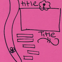
This layout was done using this sketch from 52 sketches.
After deciding on a sketch, I picked out my photos and trimmed them to fit the layout.
The next step was to find a palette. I like to layer the papers on top of each other and put the picture on top to see which colour makes the picture pop the most. This is the palette I settled on. Chocolate Chip, Old Olive, Bashful Blue, and Pacific Point.
The best colour for matting the photos was Pacific Point. Now I'm going to show you a trick I use for matting multiple photos. First you trim out your photos on a grid. I like to use the grid paper from Stampin' Up! Next you glue them all down as straight as you can. Line the pictures up with the corner of the paper so that when you are done the only colour you see is between the photos. When you line them up with a corner of the paper you ensure that they will lie straight. Then you need to trip off the other side of the paper so that your matting looks like the photo below.
As you can see the photos cover the matting. The trimming makes sure that the edges line up. Next you matte the whole thing on another piece of pacific point. You need to adhere the edges very carefully and ensure that it looks like only one piece of blue, not two.
Next I'd like to show you how to make your own sky DSP. First I punched out a whole bunch of circles of various sizes. Next I glued them together to make a mask. Then I got out bashful blue ink, whisper white paper, and a sponge. I started at the top of the page and carefully sponged around the top of the mask. I lowered the mask at various intervals and moved it around the page to create variation.
This is the final result. You need to use a very light blue like bashful blue, and you need to sponge very lightly and sparesly in order to make the effect realistic.

At the top you will see the final layout. In case you can't read the Journaling, I'll explain the title to you. On our recent vacation, my son and I went down to the beach for a few hours. He likes to make up songs and was tossing rocks and sticks into the water. He made a few sticks float, so as he was singing he came up with the line, "the water floats the rocks". He sang this same line over and over and over and over. It was hilarious. I took tons of photos and above you see the result.

Tuesday, August 11, 2009

Tuesday tutorial #14

Welcome to Tuesday Tutorial. This week's tutorial combines a sketch challenge from Sketchy Thursdays and an inspiration challenge from Inkspirations.
STEP 1 - COLOUR
I pulled the colour from the Inkspirations photo above. I used Bermuda Bay, So Saffron, Basic Gray and Whisper White. Because I was using the photo as inspiration, I decided that I needed to dig out some DSP. Plus in the sketch there was patterned paper in the circle. I lay the colours over each other in different ways and decided that I liked having Gray as the main colour and Bermuda Bay as the main accent colour.
STEP 2 - LAYOUT
This was easy as I absolutely loved this sketch. The only real change I made was to use 3 pictures instead of 2. The circles were cut out using my Cricut expressions. I used ink to sponge around the DSP circle to add some intrest.
STEP 3 - EMBELISHMENTS
Once I put the core of the layout together, I decided it looked too plain. I added the title which I printed off my computer and punched out with punches and movers and shapers big shot dies. Then I added the butterflies and "Palm Springs" with White signo pen. And finally I used a two way glue pen to add the glitter.

Tuesday, August 4, 2009

Tuesday Tutorial #13

This quick and easy page was made by combining some stickers with DSP. Of course this DSP had already been cut into a fancy shape. I mounted it on some pumpkin pie cardstock, added the stickers and decided to use my new nestabilities labels for the title. Once I had finished this, I added a few brad's for some extra detail and then left it at that. It took me less than 1/2 hour to make this page and most of that time was spent trying to find the best font to use - I decided on Earwig.

Tuesday, July 21, 2009

Tuesday Tutorial #11

I just couldn't wait to get down and use this paper when my box of new stuff arrived last month. This layout was inpired by a photo of me and my daughter on my brother's boat. We were having a family picnic to celebrate our birthdays which are only 12 days apart. I went through the photos from that day and pulled out a few of my brother and I. After playing around with the pictures, I decided that although I love the photo of myself and my daughter, I needed to crop her out of this layout. I'll save the entire photo for another layout. This is a new Level 3 hostess scrapbook set. I pulled out two pieces of DSP from the Lovely Flowers Hostess Bundle, and One piece of Rich Razzleberry cardstock.

I then played around with my central photo and decided to matte the photos on Rich Razzleberry as it offered the best colour contrast. Because of this, I decided that the Rich Razzleberry DSP was best for the background.

After playing around a bit, I decided on the above layout to start. This changed as I moved around the background paper.


After some experimentation, I decided to use these three piece of DSP from Lovely Flowers and print out my journaling right on to the DSP itself. But the DSP needed to be small enough to fit in my printer, so I cropped it to 8 inches. After I printed out the journalling, I decided to trim the overlapping edges with the scallop edge punch. And finally I adhered the three pieces of DSP together. A great tip is that if you are putting together paper to make a background for a 12x12 page, the scor pal works wonders. By lining it up in the actual scor pal, the edges will be all straight and the paper will line up perfectly.


Because I needed to crop the smaller picture of my brother and I carefully to cut out distracting images, I decided to use my largest circle punch (2 3/8inch) but a coluzzle or circle scissor plus would work as well. The only problem for me was that when I punched out the circle, part of the image got damaged near the edge. To fix the problem, I decided to sand the edges of the picture which was simple enough to do with the smaller circle images. I then needed to sand the larger photos, and found it to be very difficult until I lined the page edge up with the edge of the table which gave me some even resistance and made for a nice edge. Finally I added to the layout a picture of my brother and me as children, and a picture of our birthday cake from last month. To make the '40' out of DSP I started with the 1 3/8 inch circle punch and then used the 1 1/4 inch punch to make the '0' Next I cut the '4' by hand to match the size of the '0'
Once I did my journaling, the title fell into place quite nicely. The white letters are cut with the Bilboard die for the big shot. The coloured flowers are cut from the DSP on the end. I used the wide oval punch for the sub-title and large oval scallop nesties. Some of the photos and the number '40' are popped up with dimensionals.

Tuesday, July 14, 2009

Tuesday Tutorial # 10

Can you believe it??? It's been 10 weeks of Tuesday Tutorials This week's layout was inspired by a colour challenge from SPCC. Click on the photo for a link to the site.
Samantha, the scrapmaster, who runs SPCC also has her own blog which you can link to by clicking the picture of the pink layout. She posts scrapbook layout challenges on her personal blog Scrapmaster's Paradise. Anyway, I digress, back to the tutorial.
STEP 1 LAYOUT:
This was easy as I had already chosen the one above.
STEP 2 COLOURS
The first thing I did was get out my ink pads of the 4 challenge colours and put them together on my work table. What struck me immediately, was how vibrant each colour looked against the beige colour of the plastic ink pad container. I immediately thought of using Very Vanilla with these colours. Then I needed to decide which of these colours was going to be my background colour. I had already decided that I wanted to use the Circle Circus stamp set, so I got out some Very Vanilla cardstock and stamped out each stamp in the 4 colours. I punched them all out with my various circle punches and then lay them each out on paper to decide what would be the best background. Chocolate Chip was a clear winner. With colour and layout decided, the next step was...
STEP 3 PHOTO
Oh yeah, I actually started a layout with no idea what the photo was going to be. Now normally I always choose my photo, and then pull colours from the photos for the layout, but this time I went in a completely different direction. I actually do have a box of photos that I have printed off, but never scrapped and in this box I had this gorgeous photo of my hubby's brother and his sister's son (my nephew). I could have enlarged and reprinted this photo because I usually scrap on a 12x12 size. But those of you who have been following me for some time know about my collection of 8x8 shadowboxes that I regularly change. So I decided that it was time for an 8x8 layout and didn't enlarge the photo. Instead I cropped it down a bit to fit the layout. Mounting the photo on Kiwi Kiss was a given as the trees in the background are the same colour. And the photo itself looked really uninspiring on Chocolate Chip.
I lay the circles out in a sweeping arc like on the layout and popped a few of the smaller ones up on dimensionals. The scalloped medalion was made by layering several of the circles and adding a filigree brad to the centre. It was also popped up on dimensionals. The titles were rub ons from my collection and I used a white signo pen to draw the cloud and write the journaling. Below you can see the photo in it's shadowbox.
Stamps: Circle Circus. Ink: Baja Breeze, Rich Razzleberry, Kiwi Kiss. Paper: Very Vanilla, Chocolate Chip, Kiwi Kiss. Accessories: Various Circle punches and scallop circle punch. Greatest Moments rub-ons, Signo Gel pen.

Tuesday, July 7, 2009

Tuesday Tutorial #9

Welcome to Tuesday Tutorial. Today I am going through the steps to complete two different challenges with one layout. The first challenge was to use negative space, and the second challenge involved several steps. They were: 2 different patterned papers, 2 or 3 photos, Ribbons, Buttons, and Stamping.
STEP ONE: photos
I started with the photos this time. I decided that in order to emphasize negative space, and yet fit in all those elements for the 2nd challenge, I needed to use small photos. I had all these photos of my kids playing in their wading pool, but I had to edit out my nephew who was bare naked and I wanted to show the sheer joy on my kids faces from playing in their pool. Unfortunately I was not able to find the apropriate photo of my son from this day, but I found 2 of my daughter. These photos needed to be cropped down and distracting elements needed to be hidden behind embelishments, so the layout was pretty fluid at first. So what I focused on second, after the photos, was colour.
STEP TWO: colour
I chose colours from the photo. I focused on soft pink and soft blue. I had this wonderful piece of rice paper in my stash, so I decided to adhere it to white cardstock and then used zig-zag stitch to sew it in place. I really like the result. The paper looks textured and is reminiscent of water surface. Unfortunately it's not terribly clear in the photo below.

So once I had stitched the papers together, I matted the photos in white, blue DSP, and turquoise cardstock. This brought me to the next step.
STEP THREE: layout
Remember that layout was a bit fluid as I was working with 'less than perfect' photos. Because the photo was dark, I used white as the first layer of matting. The next layer was DSP as it was very similar in colour to the background paper, and then I mounted it on turquoise cardstock to give contrast between the two similar papers. Then I played around with the two pictures to layer them and hide imperfections.

Eventually I came up with this layout. Then I decided to look at stamping.
STEP FOUR: stamping
Well, I knew I couldn't stamp on the rice paper and get the effect I wanted, so I stamped with Brown Staz-On onto watercolour paper. I used the retired stamp set Time Well Spent. I then used re-inkers, stampin' write markers and aqua painters to colour in the flowers. Then I cut out the flowers and moved them around on the page to find the layout I wanted. While I was doing this, I started to think about the elements I still needed to add to complete the challenge.
STEP FIVE: buttons
Well buttons were easy. I knew I could use them with the flowers, and Stampin' UP! has these fabulous flower buttons, so I pulled out a few and used them to centre the watercoloured flowers.
STEP SIX: 2 kinds of patterned paper. Well I had one kind matting the photos, but I needed to add another. Now I didn't want to overwhelm the layout as negative space was important, so I went through my stash of retired DSP and pulled out those with turquoise in them. The best thing about Stampin' Up! is that all the colours coordinate, and so I knew that the blues would completely match if I stuck with SU product. I printed the journaling right on the patterned paper and added the paper with turquoise and green flowers as well.

So above is another layout with me playing around with the photos and flowers. Then I added the flowers and finally
STEP SEVEN: ribbons
I decided that this pink gingham ribbon went perfectly, so I added a band to the bottom, and a bow to the top.
STEP EIGHT: putting it all together
Finally I adhered it all together on top of the rice paper. Most of the flowers were popped up with dimensionals. Below you see the finished product.

Tuesday, June 30, 2009

Tuesday Tutorial #8

Welcome to Tuesday Tutorial. Today's tutorial will focus on one photo layouts. I had this gorgeous photo of my kids which was just screaming for a scrapbook page.
STEP 1 LAYOUT:
I looked through my scrap maps and came up with this one from http://www.pagemaps.com/
I apologize that it's a bit blurry. One of the things that drew me to this page was it's use of stitching. I have never used the sewing machine on paper before and I decided that this was a great place to start. Another thing I have learned about my scrapbooking habits is that I really need to figure out my colours and then play around with the layout to find a combination that works for me.
STEP 2 - COLOUR:
I find that I am immediately drawn to some colour combinations. This page was really difficult for me. I tried to draw colours out of the photo, but when I played around with them and the picture, I didn't like any of them with the photo itself. Eventually I came up with Chocolate Chip and Sage Shadow and white.
This is an example of the first paper I sewed. I decided to adhere the paper on the cardstock first and then run it through the machine. (much like pinning 2 fabrics together before sewing. I used the zig zag stitch and I used the widest stich so that you can really see that it's sewing. Here's a closeup.
It was kinda fun. I learned that you really need to go slow and steady. Too fast and it's hard to keep the line straight. I also learned that adhering the paper together made it really easy to sew a straight line. I feel that you really need to choose your thread carefully and I really like how this white thread is contrasted on the chocolate chip. I laid the photo out on the sage shadow cardstock and used some retired DSP and some Chocolate Chip DSP for accent paper. Then I attached the layers and sewed on them as I went. It was easier for me to sew each layer and then adhere the next. The title 'LOVE', and the oval sentiment 'you're the BEST' are rub ons. I added glitter with my 2 way glue stick which made the title really POP. Oh yeah, and the Journaling was added by putting the cardstock straight in the printer - super easy. And finally I glued on the buttons with Tombow.

Tuesday, June 23, 2009

Tuesday Tutorial #7

It all started with this gorgeous photo of my son taken on his 3rd birthday. I know, I know, I'm bragging, but isn't that a mother's perogative? Anyway, I had this beautiful photo of my son and it was just screaming for a scrapbook layout. SO... I decided to try my hand at a layout challenge at Lotus Papiere. This brings me to my first step

STEP 1: LAYOUT
So I used the layout from Lotus Papiere as a starting point. The whole point of a sketch is to make it your own. So with that in mind, I decided to try to work on getting my colours in order which led to step 2.

STEP 2 COLOUR

I really liked the colour of my son's shirt. It's a big focal point of the photo. So I tried to use a contrasting colour in order to allow his shirt to 'pop'. Sometimes I try to draw the colour out of the photo, but this time I went in another direction.


After several attempts at colour to matte the photo on (see above)  I chose Tangerine Tango as my background. This colour really contrasted with the colours in the photos. Next I found a coordinating piece of DSP in which to draw the colours from. (it's actually the reverse of the background paper).


We have, Chocolate Chip, Old Olive, Tangerine Tango, and Bashful Blue. So I pulled out my accessories and cardstock which matched these colours. Then I focused on how to matte the photo. I knew that I liked it on Tangerine Tango, so that was a natural for the first colour. I didn't have a lot of paper left, so I was limited to my DSP and a small scrap of cardstock. So I matte'd it on the DSP.


Then I added several layers until I was satisfied with the 'look'. I believe it's matte'd on 6 layers of cardstock and DSP.

STEP 3 - Back To LAYOUT!

So after looking at the sketch again, I decided that I needed to put the photo on the right side of the page because it's always a good idea to have more space on the page in the direction that the subject is facing. So I decided, based on the direction that he was facing, that the photo needed to be on the right side of the paper. SO... I rotated the sketch 180 degrees.

STEP 4 - ACCESSORIES:

So after faffing around for a long time, I decided to use the Choo Choo stampset to complete this page. The image was actually taken on Connor's real birthday and not at his birthday party, so I wanted the page to reflect his interests (trains) and yet, not show a stereotypical birthday party kind of layout, as this photo was not taken at his party.


After some time, I decided to incorporate images from "Best Wishes & More" because I wanted images that were bold and strong, not outlines of images. So above you see a photo of me playing around with the layout. Next I decided that I needed ribbon and a sentiment. I used the sentiments from Best Wishes & more and the bitty birthday sentiment. Finally I stamped the bottom sentiment with some little abc stamps I got from Mike's. But the short order alphabet stamps from SU would work great instead.


So here's the final page. It's kinda cute - just like that little guy in the photo!!!! 1 3/4" circle punch.

Tuesday, June 16, 2009

Tuesday Tutorial #6

Welcome to Tuesday Tutorial. What follows is the layout that inspired me to start Tuesday Tutorial. As I was making this layout, I decided to photograph each step for my blog and then realized that I could make this a weekly feature.
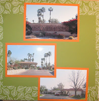
So here's the layout in its' finished form. I apologize for the 'crappy' photography. I decided that I wanted to create a layout using a bunch of photos that I took driving around the complex we were staying in. The thing about Palm Springs is that it's such a contrived environment - who decides to build 18 million golf courses in the desert???? We were staying in a complex that had over 1000 units and a full 18 hole golf course and 19 outdoor swimming pools. And this complex is only one of many in Palm Springs. So one day as we were returning to our unit, I decided to photograph the entire drive in from the passenger seat. So the photos are not anything special. So what to do when creating a multi-photo layout?

I decided that I really wanted to use the Petal Party Simply Scrappin' kit in order to expedite the process (what a joke that turned out to be as you will soon find out) The cardstock and DSP all coordinate which means you don't need to spend time fussing with matching up colours. So I took out the cardstock and laid all the photos on it and chose a colour to matte them all on. Matting them all on the same colour simplifys things and allows me to use busy'er cardstock in the layout.
After laying them all out, I decided that Pumpkin Pie was perfect as a background as it didn't detract from the colours of the photos.After matting all the pictures I placed them on DSP from the kit. The first page was still very busy on this Old Olive coloured DSP, so I placed a plain piece of 8 1/2 x 11 inch cardstock on it to reduce the busy background, but still allow for a big contrast with the photos. Page 2 of this layout was started on So Saffron cardstock. I then decided to add a strip of DSP. I really didn't want to show a lot of the Pink flowers, so I tried many layouts until I was happy. I finally decided to focus this page around the view of the golf course. I placed the photo in the middle of the page and popped it up on dimensionals for depth.
So why did it take me so long to publish this layout? Well, I decided to use the chipboard letters that I had received at regionals to make the title. And I decided to ink them up with the colours of the photos. But after deciding that the so saffron didn't work well on the grey chipboard, I decided to ink them up with white craft ink, and when that had dried, sponge on some other colours. What I failed to realize was that craft ink takes FOREVER to dry. How long you might ask? Well, 2 weeks later it was still tacky. Yes, that's right - 2 weeks later!!!! So I decided to try sponging on the colour and - well it turned out pastel. And this kit has BOLD and BRIGHT colours, so a pastel coloured title was not acceptable. So I tried to dry it with my heat gun, and it just stunk up my craft room. So I left it for ANOTHER week, and...still tacky. So, in desperation I decided to heat emboss with white embossing powder, and below you see the results. I'm not very happy with the title, but I love the rest of this layout. All of the flowers are stickers form the kit and several are popped up on dimensionals for depth. AND Petal Party is NOT retiring so look for it in the new catty in July!