Showing posts with label SPCC. Show all posts

Monday, February 1, 2010

SPCC #33

This card was so much fun to make. When I saw all those bright colours in one combo I felt a bit overwhelmed. But then I realized that I could put them all together in a birthday card. The gifts were punched out with square punches and then the sides were trimmed in at an angle to give the gifts more interest. The ribbon is not SU, but everything else is. The stamps are from the new Sale-a-bration catalogue.
The Fun Stuff:
1. Stamps: Vintage Labels
2. Ink: Tempting Turquoise, Real Red
3. Paper: Very Vanilla, Summer Sun, Real Red, Pink Passion, Tempting Turquoise
4. Accessories: Ribbon, Top Note Die for the Big shot and Finial Press textured impressions folder for the Big Shot
5. Punches: all square punches and various circle punches by SU, Scallop oval punch

Monday, January 25, 2010

SPCC #32

This card was whipped up quick and easy. I love Basic Grey and this type of layout makes the background colour the focus of the card. The stamp is from the new Sale-a-bration 2010 catalogue. I punched out the oval with the wide oval punch and then I adhered it to Creamy Caramel cardstock and very carefully cut it out.
The Fun Stuff:
1. Ink: Close to Cocoa, Creamy Caramel
2. Paper: Whisper White, Creamy Caramel, Basic Grey cardstock
3. Accessories: Organza Ribbon, Stampin' Dimensionals, Wide Oval Punch
4. Stamps: Vintage Labels

Monday, January 18, 2010

SPCC #31

Time for another SPCC challenge. This card features the new stamp set My Matryoshka. You can find it in the new Occasions Mini Catalogue. This combo seems so bright and reminds me of springtime so I knew that flowers were somthing I wanted to feature on the card. But there is no green in this combo so I snuck a bit of Mellow Moss in on the leaves. The technique I used was dipping an Aquapainter in ink and 'watercolouring' the ink on the paper. I also didn't have Apricot Appeal ribbon so I used a piece of Very Vanilla ribbon and dragged it over the Apricot Appeal stamp pad.
The Fun Stuff:
1. Stamps: My Matryoshka
2. Ink: Real Red, Apricot Appeal, Pretty In Pink, Black Staz On, Mellow Moss
3. Paper: Apricot Appeal DSP, Real Red, Whisper White, Pretty in Pink cardstock.
4. Accessories: 1/4" very vanilla grosgrain ribbon, 3/4" circle punch, stampin' dimensionals

Monday, January 11, 2010

SPCC #30


Time for another SPCC colour challenge. Wow was this one a challenge. I made several different cards until I came up with this one. This card was made on MDS (My Digital Studio) and then printed out twice and pieced together. Basically it's a hybrid. First I printed out the card twice and then I cut out the cupcake from one card and layered it on top of the other card front. The only problem was that the cupcake top didn't look right. So I traced it on a piece of Orange paper from the new Sweet Pea DSP from the 2010 Occasions Mini Catalogue. The Recipe:
1. MDS - brushes (stamps) Big Bold Birthday
2. Digital Paper - So Saffron Brocade
3. Font - Freestyle Script
4. Paper - Chocolate Chip cardstock, Very vanilla cardstock, Sweet Pea DSP
5. Ink - Only Orange, Yoyo Yellow

Monday, December 14, 2009

SPCC #28

This page was made using My Digital Studio from Stampin' Up! My Father-in-law took this awesome photo of my daughter so I just needed to scrap it. I struggled with this colour combo at first, but then I decided to focus on the colour I liked the best which was Bordering Blue. A quick look through the DSP files and I realized that there is no DSP in MDS which has Bordering Blue. So I decided to make my own.
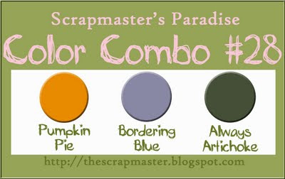
Here's how I did it:
1. Set the background paper as Bordering Blue Cardstock - using the tools on the right side of the project screen.
2. Add the black & white DSP as a page layer using the tools on the left side of the project screen. I used Night & Day. Crop the page layer so it's just as big as the entire page.
3. Reduce the Opacity. I reduced it to 20%. Now it looks like there's Bordering Blue DSP.
After I figured out the background paper I added punches, stamps, and other embellishments to finish the page. Look at the bottom for the recipe.


The recipe:

1. Stamps (Brushes on MDS) Always, Greatest Moments, Best Wishes and More

2. Punches - 5-petal flower, Curly Label

3. Embellishments - Filigre Brads from Hodgepodge Hardware, Buttons from Button Bouquet, Whisper White Grosgrain Ribbon and White Stitching.

Monday, December 7, 2009

SPCC Combo #27

Welcome to another SPCC colour combo. This week's combo is one of my favourite. I couldn't wait to use my new Fancy Favor Bigz die for the Big Shot. I combined it with the gift stamp from last year's Deer Friends hostess set. The tag on the handle is cut with the Lots of Tags sizzlits die. The polka dot paper is from the hostess set patterns pack from last year's catty.

Monday, November 30, 2009

SPCC #26

It's SPCC time again. This week's card came together fairly quickly for me. It's hard to tell with the watermark, but the sentiment is actually a rub-on. The red cardstock was cut out with the Top Note die and the lavendar cardstock was punched out with the large snowflake punch. The white snowflake is a felt flurry and I used a rhinestone brad to hold it all together.

Monday, November 23, 2009

SPCC Christmas again?

This color combo just screams Christmas to me. It was fairly simple for me to come out with this layout. Don’t you just love it when some cards just ‘come’ to you? The layout for this is very similar to one I made last Christmas. Click here for the post.

Here’s the Recipe:
1. Stamps – Snow Swirled
2. Paper – Handsome Hunter, Certainly Celery, Very Vanilla, Kraft Cardstock
3. Ink – VersaMark, Old Olive
4. Accessories – Top Note Die and Final Press Impressions folder for Big Shot
5. Ribbon – ½” White Satin and ¼” Certainly Celery Grosgrain
6. White Embossing powder and Heat Gun

Monday, November 16, 2009

SPCC Birthday


Welcome to Monday and another SPCC color challenge. This is a hybrid card made from MDS (My Digital Studio). I made the card on MDS and then printed out the parts and cut them out. I then put the card together. You can see the layers in the above photos. The digital images are below. As you can probably see I altered the layout slightly with the real card.

Here’s the Recipe
1. Paper – Whisper White, Bashful Blue Cardstock, Digital Happy BDay DSP
2. Stamp Images – Party Hearty
3. Accessories – Real Red Brads, ¼” Whisper White Grosgrain Ribbon

Monday, November 9, 2009

SPCC Monday

It's time for SPCC once again!!! This week it's a 4 colour challenge and let me tell you that I found this one a real challenge. So I went back to my old standby of adding a lot of Whisper White. These balloons were made with circle punches and a tiny bit cut with craft scissors.
Here’s the recipe.
1. Stamps – Delightful Decorations
2. Ink – Not Quite Navy
3. Cardstock – Whisper White, Yoyo Yellow, Not Quite Navy, Melon Mambo.
4. DSP – Razzleberry Lemonade
5. Accessories: 1”, and ¾” circle punches, Finial Press Big Shot Folder,
¼” Basic Black Grosgrain Ribbon, Silver Thread, Stampin’ Dimensionals.

Monday, November 2, 2009

SPCC #22

Another Monday means another fabulous colour combo over at SPCC. I had so much fun making this card. I used a sketch from Mojo Monday from a few weeks back. This colour combo immediately brought to mind last years retired DSP Autumn Vine. I know that it's a few days after Halloween, but I really wanted to try out this stampset Eat, Drinkk & Be Scary. Now I don't own a lot of Halloween stamps because I don't really give out Halloween cards, but this set was a digital stamp in MDS (My Digital Studio). So I made up a blank card with all the images in various colours, and then I printed it out. Next I cut out the stamped images using punches, and surprise, surprise, they were the right size. I punched out the images and then cut out some of the other images with craft scissors. All the images were layered and popped up with dimensionals. The ribbons used are both grosgrain. I turned over the polka dotted Dusty Durango ribbon.

Monday, October 26, 2009

SPCC # 21

Time for another challenge over at SPCC. I found this colour combo a bit challenging. I know that initially they look like autumn colours, but the Bravo Burgundy really threw me. But then I found this DSP from my stash and it all fell into place. Paper and Ink Colours Ruby Red, Bravo Burgundy, Creamy Caramel, Very Vanilla. Accessories: 2 step stamping, aquapainters, 1/4" grosgrain ribbon, hodgepodge hardware.

Sunday, October 25, 2009

SPCC again!

Here is yet another project I made for this week's DRS stamps celebration at SPCC. I can't wait to use these stamps in other colours to show you just how versatile they are. But anyway, this time I coloured in the butterflies again, but then I carefully cut them out and popped them up on dimensionals.

Thursday, October 22, 2009

More SPCC

This week at SPCC we are using DRS stamps. To celebrate, we have been asked to make more than one sample for the challenge. This page was made using an old picture of my Mom, up on Seymour Mountain when she was a year old. The picture was coloured in by hand at some point as was the fashion in the 30's. The 2 DRS stamps used are the Butterfly stamp and the textured background stamp on the green cardstock. The ribbon is 1/2" polka dot grosgrain. I used the top note die and the labels 4 nesties to mount the butterflies on. The very vanilla cardstock was run through the big shot using the finial press textured impressions die. The butterflies were coloured in with an aquapainter. The tulip die from the big shot was used to make the rust coloured die cut. I also used hodgepodge Hardware and the pretties kit to finish things off. The DSP is from the Raspberry Lemonade set.

Monday, October 19, 2009

SPCC #20

Yeah it's time for a new SPCC Color combo. This card uses stamps from DRS Stamps. All the other product is Stampin' Up! Paper & Ink Colours: Really Rust, Crushed Curry, Always Artichoke, Whisper White. Accessories: 1/2" polka dot grosgrain in Crushed Curry. Stampin' Write Markers, and Aqua Painter.

Monday, October 12, 2009

SPCC combo number 19

HAPPY TURKEY DAY CANADA!!! - I just have to throw that in here as today is Canadian Thanksgiving. Why is it not the same as the American Thanksgiving you might ask???? Well, seeing as we live a bit further North, our harvest is a bit sooner, and so we celebrate is a bit earlier. (Not that many of us actually harvest our own food anymore) - but I digress. Today is Monday and time for another wonderful colour challenge over at SPCC. Please check out the blog to see what wonderful prizes are up for grabs this week. I know that Samantha, the scrapmaster, works hard to secure awesome prizes for you every week.
Wow do I LOVE this colour combo. Purple and Green is my fav, I tell you. Samantha never ceases to AMAZE me with her talent at picking colour combos. For this card I used the Petal Pizzaz stamp set which is one of my fav's as well. I tried, I really tried to make this an all Stampin' UP! card, but until they come out with something as awesome as nestabilities, I have to use my nesties once in a while. So I used the scallop rectangle and the labels 4 dies. All the paper, all the stamps, all the ink is SU! I stamped the images and carefully cut around them and popped them all up on dimensionals. I used Stampin' Write markers to colour in the sentiment which is from the Full of Life stamp set.

Monday, October 5, 2009

SPCC #18

Welcome to another example from a great colour combo from SPCC. Wow did I find this colour combo really challenging. I absolutely love this vellum DSP that I used. It's from Colorbok and I used most of this pad in my wedding album which has been featured on this blog. I really like the way the pattern popped out on top of the Dusty Durango DSP. The ribbon is from my stash and the vellum, metal tag was from the dollar store. I added a retired rub-on from Stampin Up! and attached it to a piece of Very Vanilla cardstock that I punched out using my nesties. The eyelets are from the dollar store and the scrapmaster.
Please check out SPCC to see what the fabulous prizes are this week. Don't feel intimidated to enter. We LOVE to see what you all come up with.

Monday, September 28, 2009

Best Wishes - SPCC #17

This card was made for this week's SPCC's colour challenge. I had a lot of fun making this card. I used DSP donated by the Scrapmaster herself and a stamp from DRS stamps. Check out future challenges as DRS has a sponsor week and you will get an awesome sampling of their offerings. I absolutely LOVE this butterfly stamp and as soon as I saw it I knew i HAD to have it. The image was stamped using Always Artichoke ink as it offered up a stronger image. I used my Stampin' Write markers to colour in the Bashful blue, and my Blender pens to colour in the rest. The ribbon slide and the frame are from the Very Vanilla Hodgepodge Hardware set from Stampin' Up! And the sentiment is from Sincere Salutations which is one of the most affordable and most versatile sets that Stampin' Up! offers.

Sunday, September 27, 2009

SP Christmas Color Combos

This is my second post today, please scroll down for more...
That Samantha, the Scrapmaster over at SPCC, she's sooooooo busy. Right now she's posting Christmas Color Challenges on the SPCC blog. They aren't on any set date, so you have to check regularly to see if there's a new one. This card was made for Christmas Combo #3 and for Clean & Simple's Fall-to-Layout # 61

Monday, September 21, 2009

Build-a-bear SPCC #16

OK isn't this the most fabulous colour combo? Of all the one's SPCC has come up with - this is my absolute FAVOURITE!!!! This card was made using the fabulous new dies for the Big-Shot. Stampin' Up! has teamed up with Build-a-Bear and come up with these fabulous dies for the big shot. You can mix and match papers and colours and create your own bear - A La Build-a-Bear's own products. It was super easy for me to make this card and I have to say I absolutely LOVE the result. This card was made using the new Cottage Wall DSP and cardstock from the combo colours. Looking for Whisper White? Check out the polka dots on the bear's sweater. I ran out of Tempting Turquoise cardstock, so I made the shoes out of Going Grey and then sponged them in Tempting Turquoise ink. I really like the result and it was sooooooooo easy to do.
Of course this card was created for SPCC's challenge this week. Check out SPCC to see what the amazing sponsors have offered up for the winner. I know you will absolutely LOVE the prizes.