STEP 1 - SORT and SELECT your PHOTOS
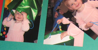
I went through all the photos and selected the "best" ones. I was looking for photos in focus, containing a large selection of family, and I wanted one of my son blowing out the candles on his cupcake. Also, I took a selection of photos of my daughter playing with a gift bag and I chose 4 that were in focus. I printed out a sheet of photos on 11x8.5 paper, a few photos on 6x4 paper and I enlarged the one of the birthday candles to 5x7. I couldn't enlarge it any more because it went out of focus. Originally I was thinking of cropping the 5x7 so I made it as large as I was comfortable. Then I cropped the photos as below.
STEP 2 - COLOUR
Next I focused on colour. I knew that I wanted to use primary colours as this was for a child's birthday party. So naturally I pulled a few out of the Bold Brights. I laid the pictures out on a few different colours until I found a few that I really liked. I used 4 different colours and black and white. You don't want to use too many colours in a busy layout.
I decided to matte a few on Glorious Green and a few on Tempting Turquoise. I knew that I wanted to use my new Choo Choo stamps from the Occasions Mini and the coordinating train track wheel. So I ran the train track wheel over Brilliant Blue cardstock, cut it out and laid it down on Real Red 12x12 cardstock.
STEP 3 - LAYOUT
I decided that I would start with a simple layout like below. I've used this layout before. I knew that a simple structure was needed as the basis of this layout. With so many photos, I knew that a basic background, with plain cardstock, was needed. Fancy DSP would overwhelm the pictures and make for a layout that was too busy.
I laid the matted photos out on the 8.5x11 cardstock and found a pleasing layout that filled most of the cardstock. You will see in the final layout below. I also popped up a few photos for emphasis and to hide flaws in other pictures. I wanted to focus on the photo of my son blowing out the candles and decided that this photo of him on the sofa with his cousins, grandmothers, and mother, captured the spirit of the day.
STEP 4 - JOURNALLING OR NOT?
I used the title "Connor Turns 3" and then I decided that was all the writing needed. All the photos are of family, and the date and year are obvious in the title, so in order to simplify the layout, I chose not to journal. After I decided not to journal, I decided to jazz up the title a bit. So I used a technique based on the scrapbook page we made at Regionals. I stamped some letters in Glorious Green, used sponge daubers and ink to colour some chipboard letters in Real Red and Brilliant Blue. I mounted them all on circles punched with my 1 3/8 inch and 1 1/4 inch circle punches. The trains were stamped in the various colours and then cut out with craft scissors. I popped out part of them with dimensionals.
I started with the title on the top of the first page and moved it to the bottom of the second page for interest. I put a few extra trains around the pictures to fill in the spaces.


1 comment:
great ideas... great work..thanks for sharing.
___________________
Rozydesouza
Entertainment at one stop
Post a Comment